Decided to play around with a better ‘placeholder logo’ kind of image for this site because the previous one is horrendous. It’s always good to be able to look back and critique your own past work.
How did the previous logo came about anyway? I drew it on paper and used Illustrator to cut it out. I’m no expert at it, but I wanted to experiment and find out how designers copied and digitalised their handmade work.
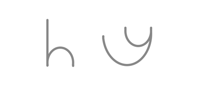
Moving on to creating a new ‘placeholder logo’ - for an hour, I decided to play around with 2 very simple shapes, that can represent two alphabets, ‘h’ and ‘y’:
Firstly, I played around with the ‘straight’ shape. Didn’t like it because I had the impression that straight defined rigidity and stiffness…
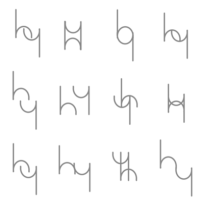
Moved on to the ‘rounder’ shape. I think I preferred this better. And this exercise gave me more thoughts of ‘This might work’ as compared to the first round.
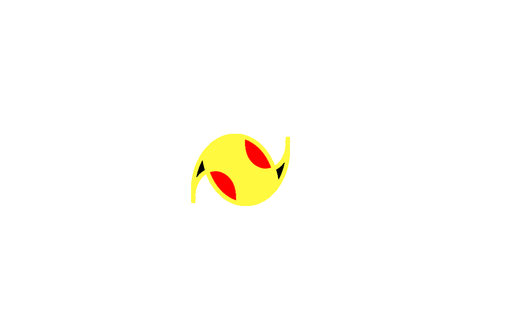
I also thought one of them looked like a Pikachu if I added some color … here …
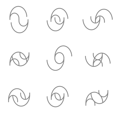
And just for fun, mixed the two up and made some shapes. Well …
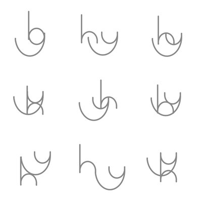
Decided on the current one after reviewing what I had. Again, I’m no expert at visual design, so I just went with what I liked most!

Comments