While looking around for inspiration for the site’s nav bar, I came across some pretty interesting nav bar examples that I’d thought to share… they’re by no means the best, and I’m no expert in this particular area.
1 Spook Studio
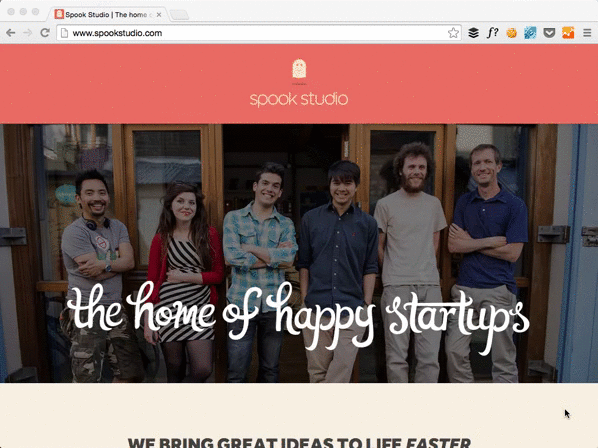
This was the primary inspiration for this site’s nav bar. I’m still meddling around with the site’s layout and it’s far from perfect…
2 Outdoors.io
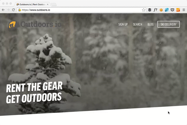
Don’t really fancy the white background going over the logo when the page scrolls… but I like how the nav bar was emphasized with white and the snowing video was darkened.
3 The San Francisco Globe
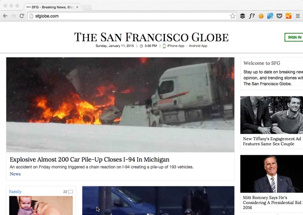
Love how ‘The San Francisco Globe’ condenses to simply just its initials. Zen. I think the site isn’t entirely responsive though, the ‘SIGN UP’ button is cut off at this particular width.
4 Invision App
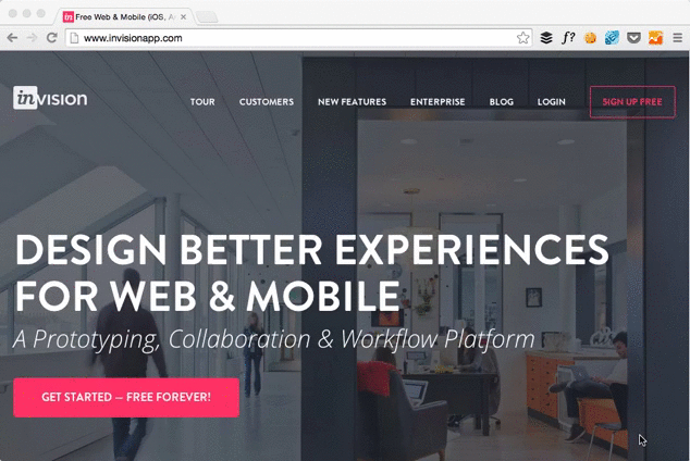
Locking the nav bar at the top while scrolling is a very common thing to do… but I like its clean color scheme. Love white font over dark backgrounds….
5 Twitter
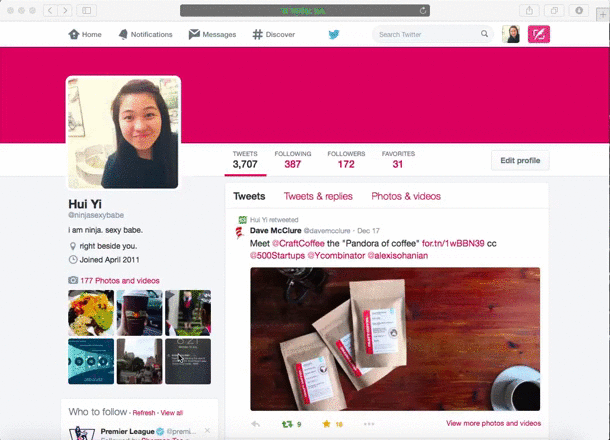
While this isn’t exactly a nav bar, I thought it was interesting to see the changes from the Profile picture to a condensed logo version. Not sure if it’s a bug or what, but it doesn’t appear the same way on Chrome and Fox.
And here’s a site with more naviation inspiration.
I’m personally still a fan of keeping it on the top though, where it’s the most intuitive, and also most visible.
I think one of the main problems with such nav bars is its loading time? While it looks pretty when scrolling, if it slows the loading of the page considerably, then I wouldn’t think it’s good to implement, since it deters the user from a smooth experience. Any ideas on how to implement such a nav bar, yet maintain smooth loading of the page?
Comments